


Peppa Pig
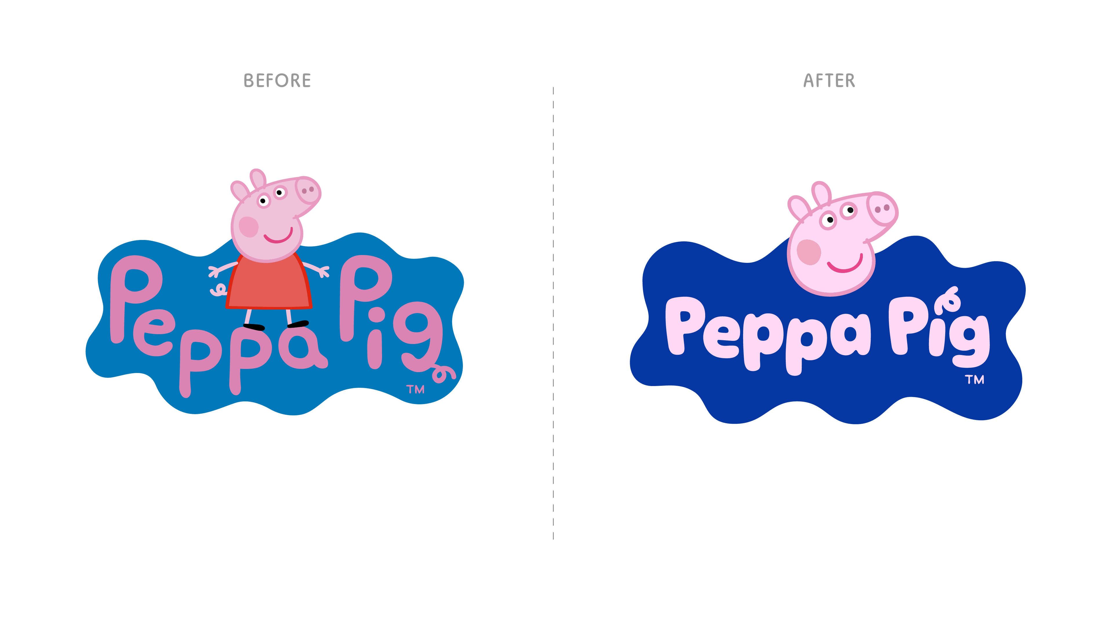
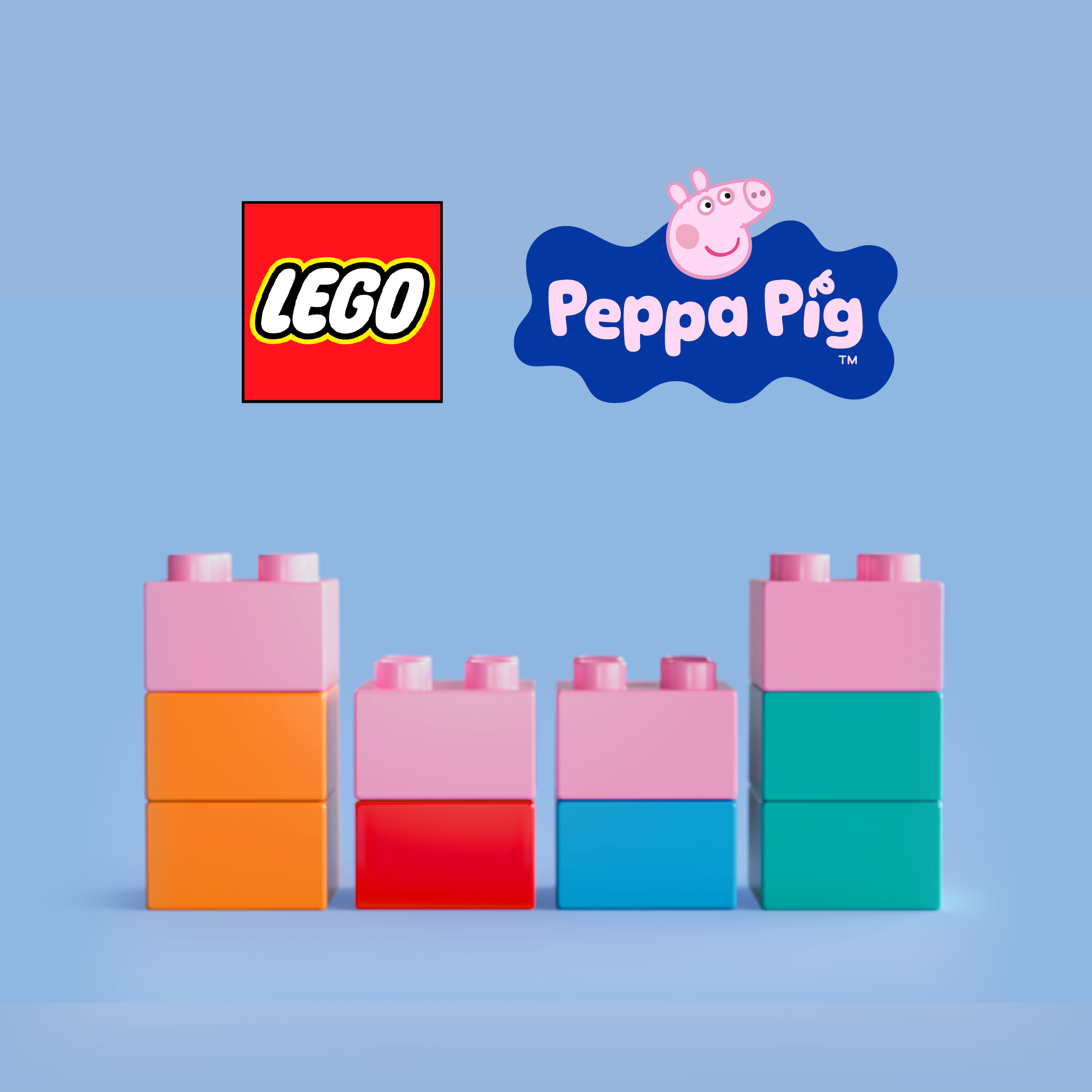
Every kid loves Peppa Pig. However, due to market competition – most formidably, Bluey – Peppa and her friends were beginning to feel a bit outdated and overly childish. How could we give Peppa a makover that didn't alienate her current fans, while introducing her to new audiences? We were invited to explore what a refreshed Peppa identity could look like. There was only one rule: do not change or edit the characters or animation of the show itself.
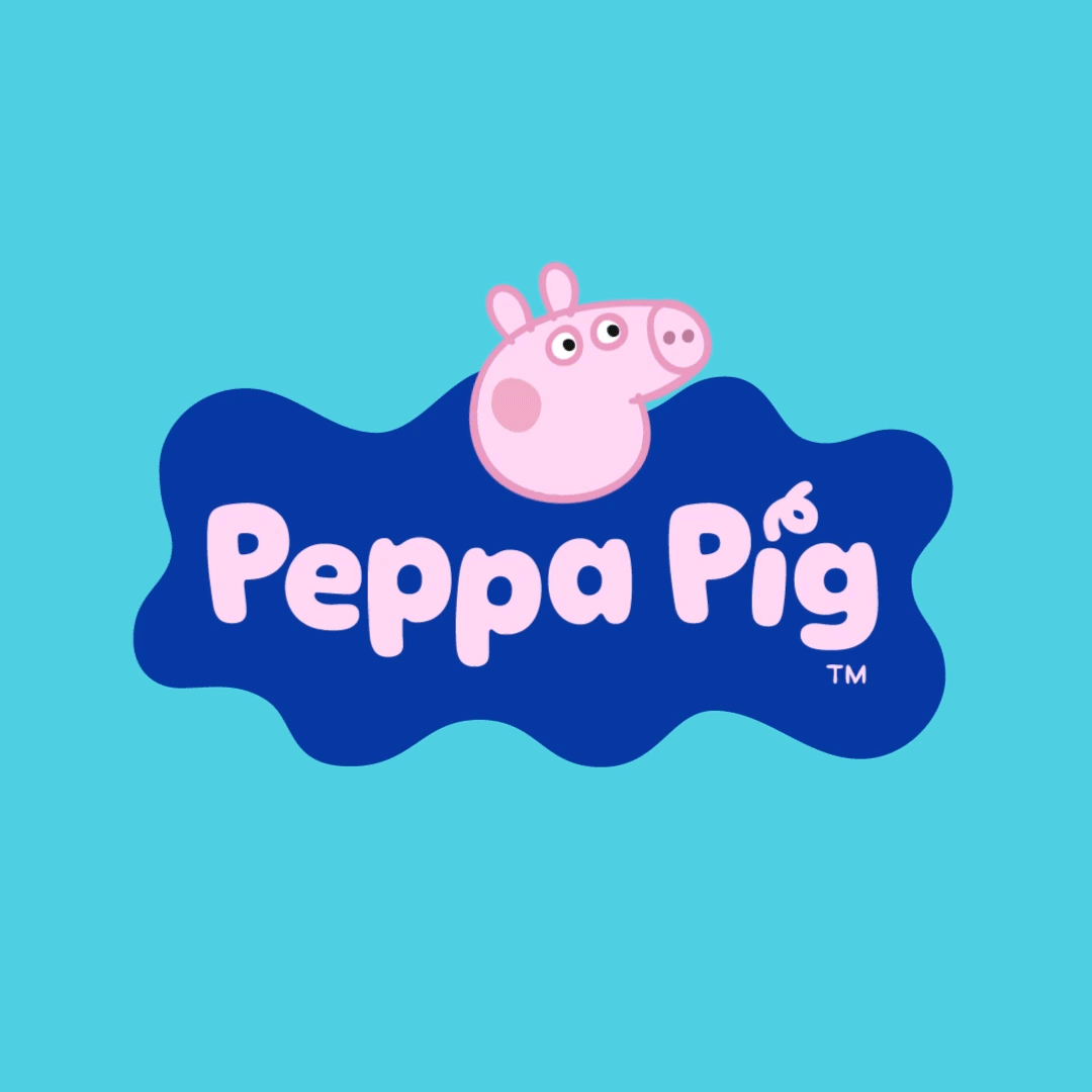
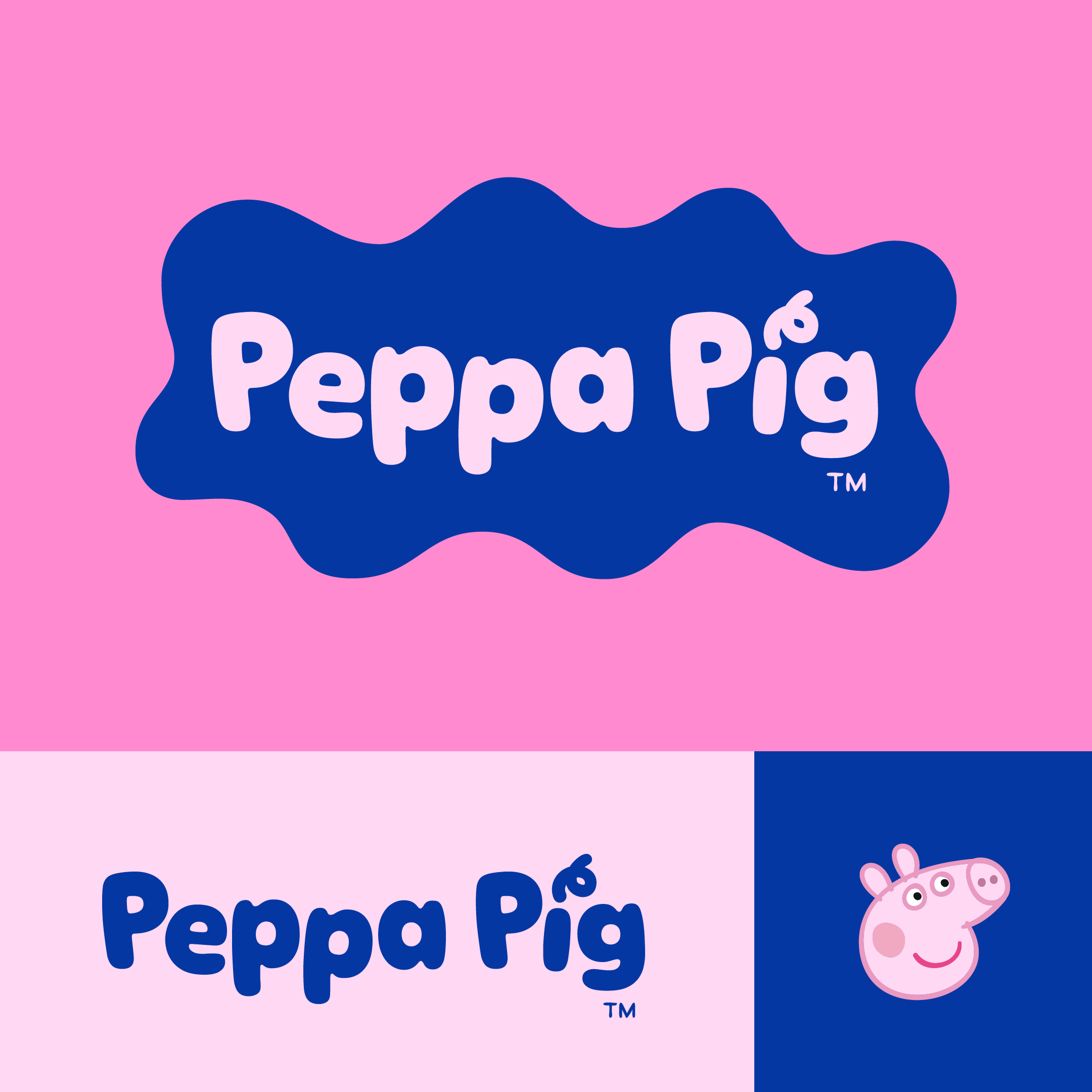
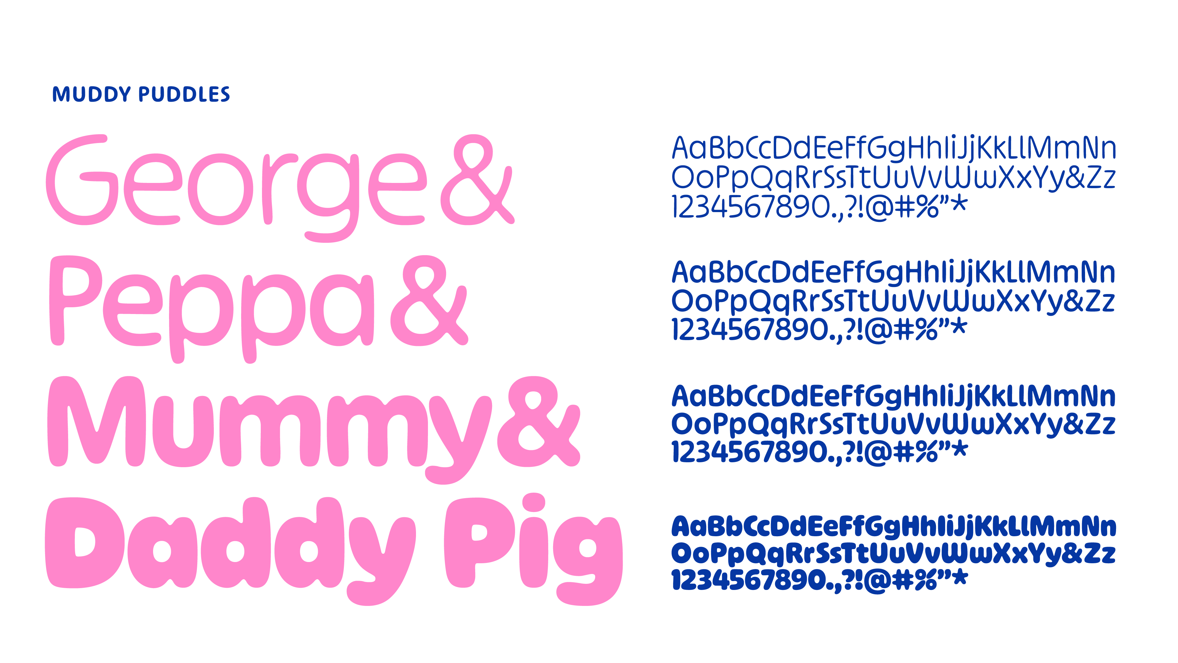
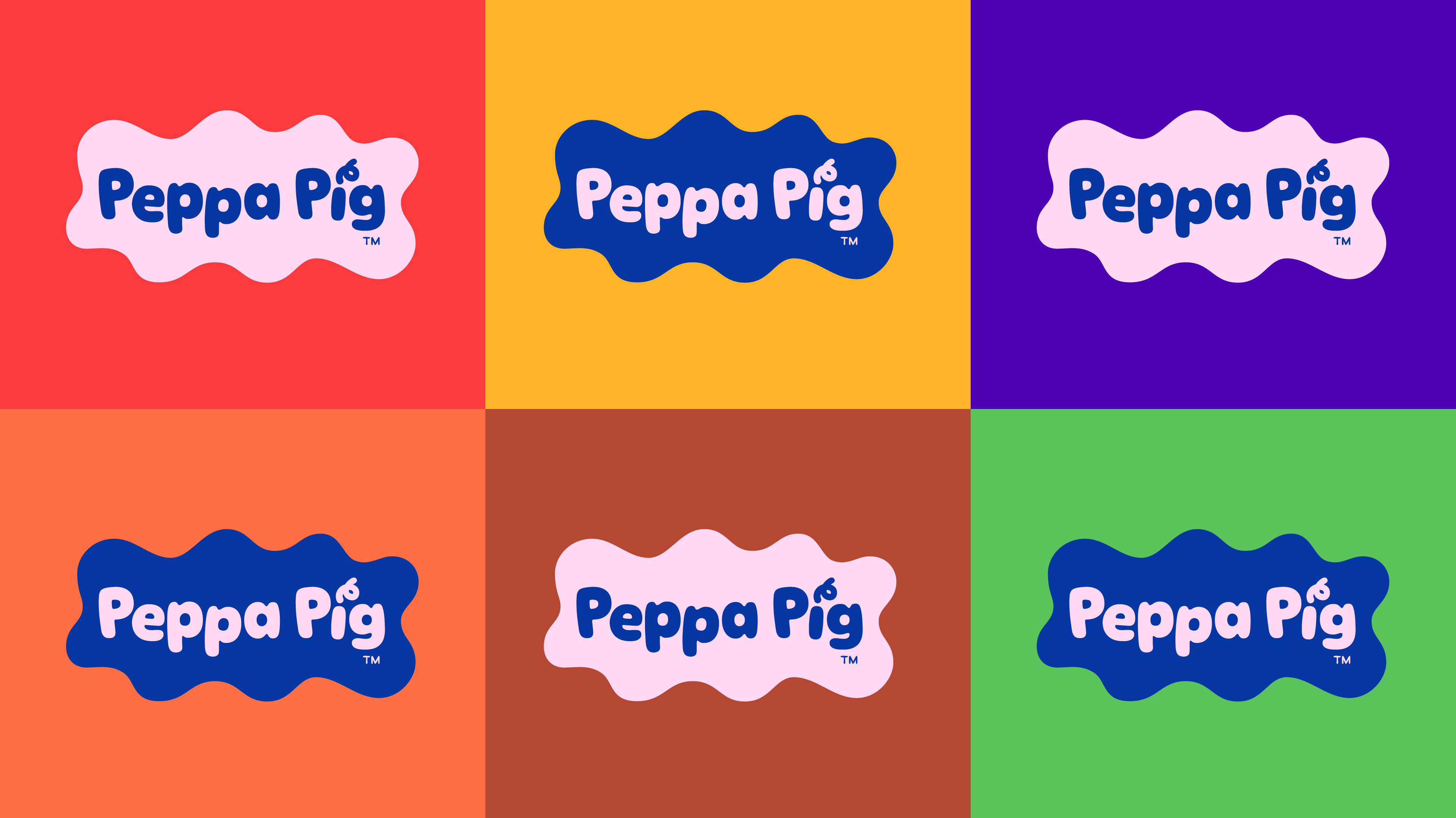
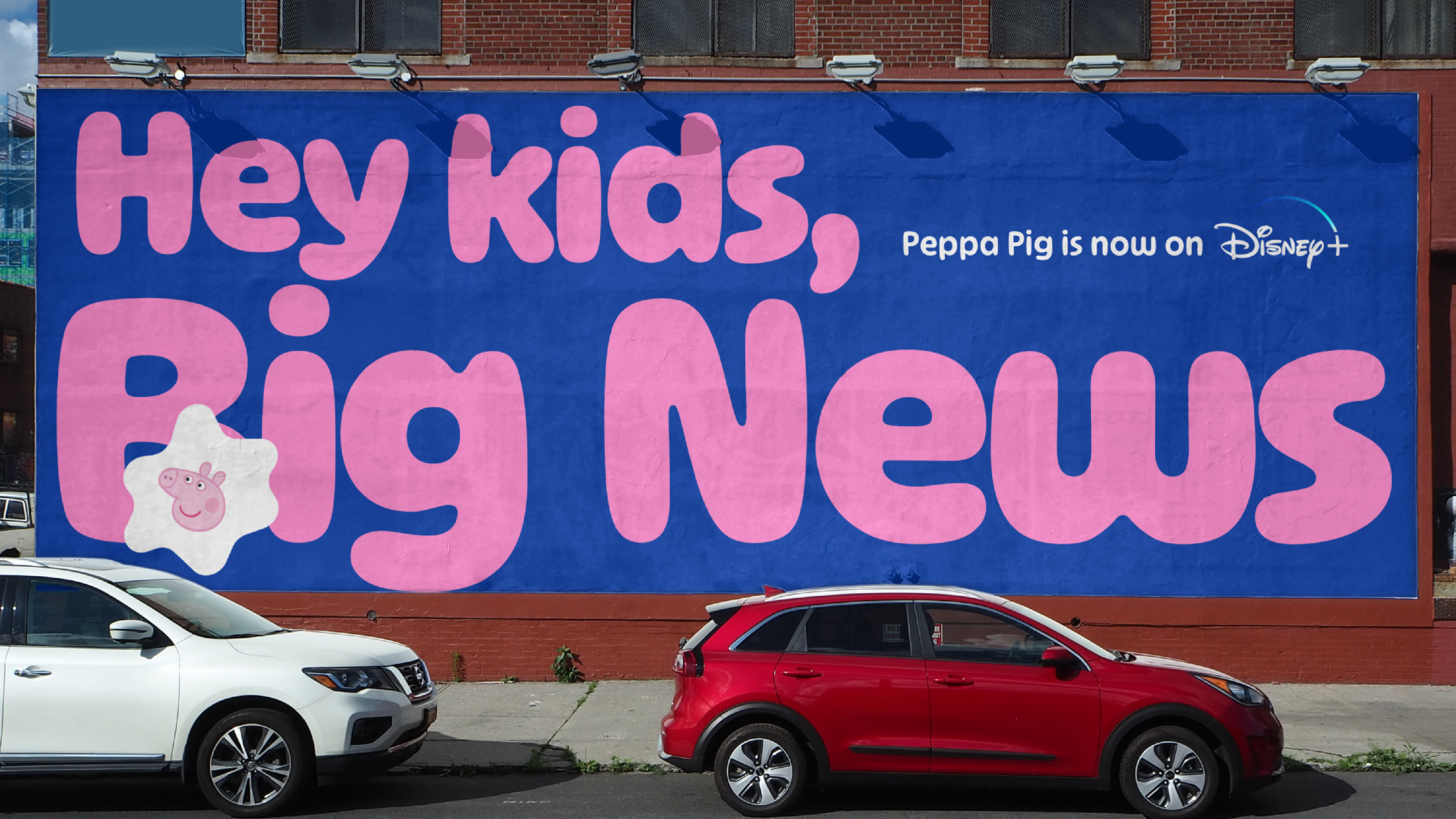
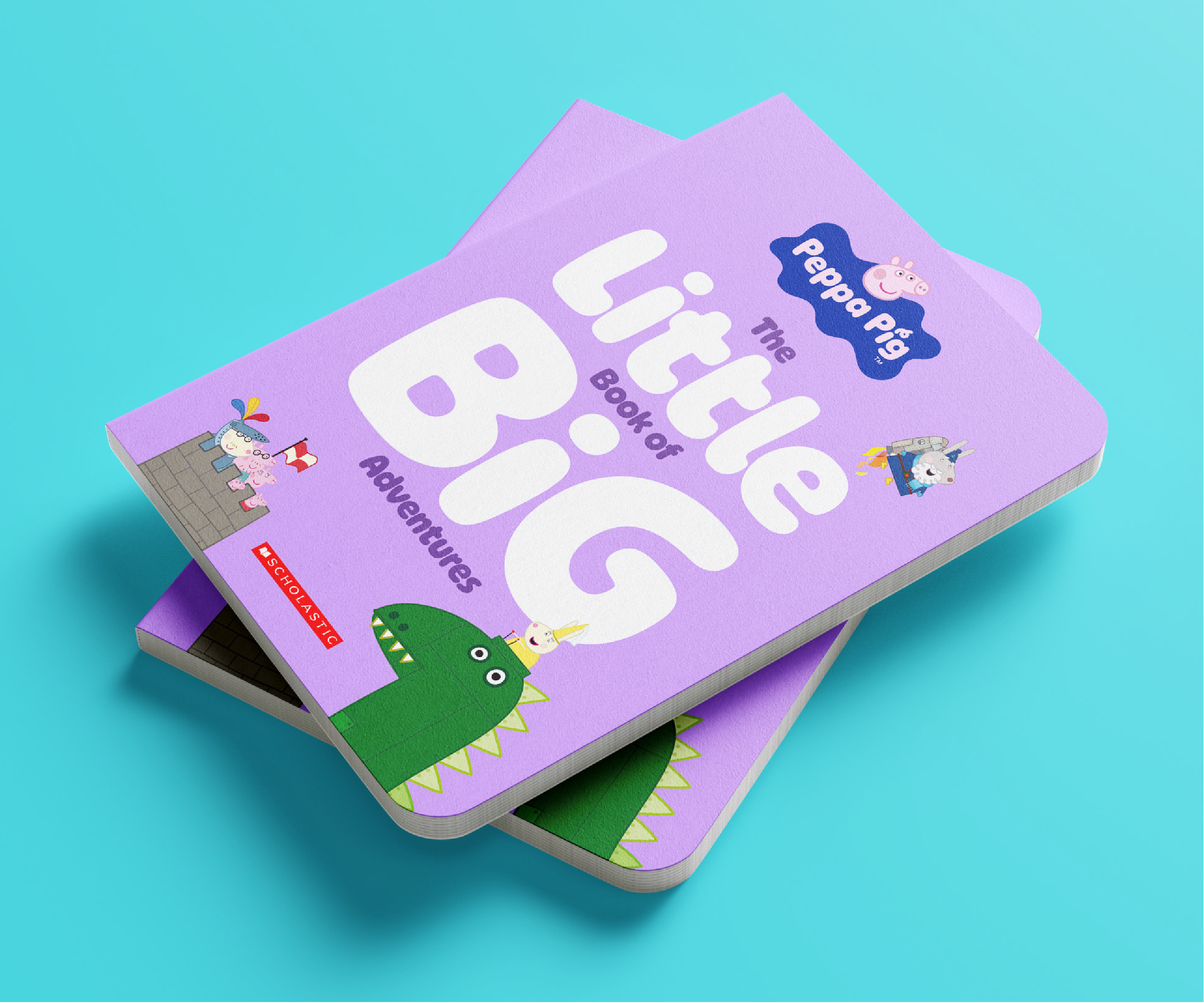
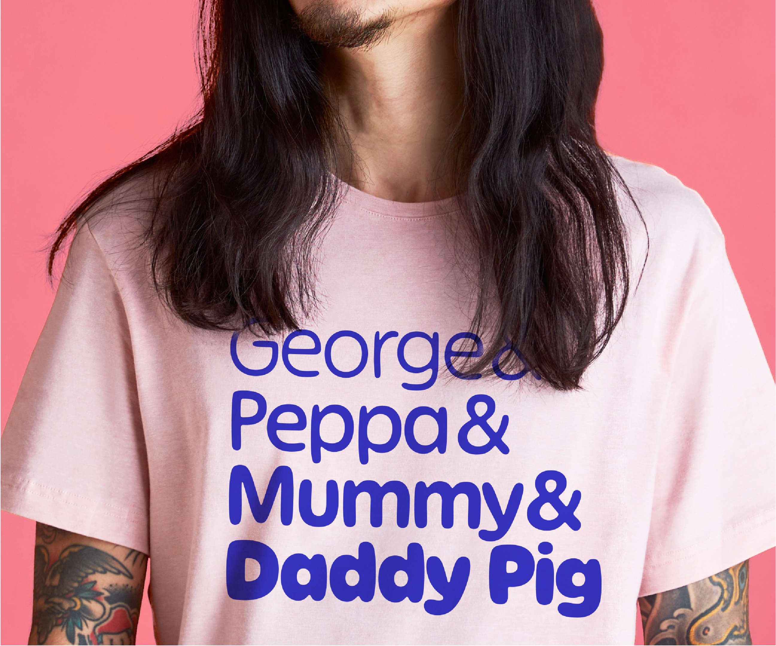
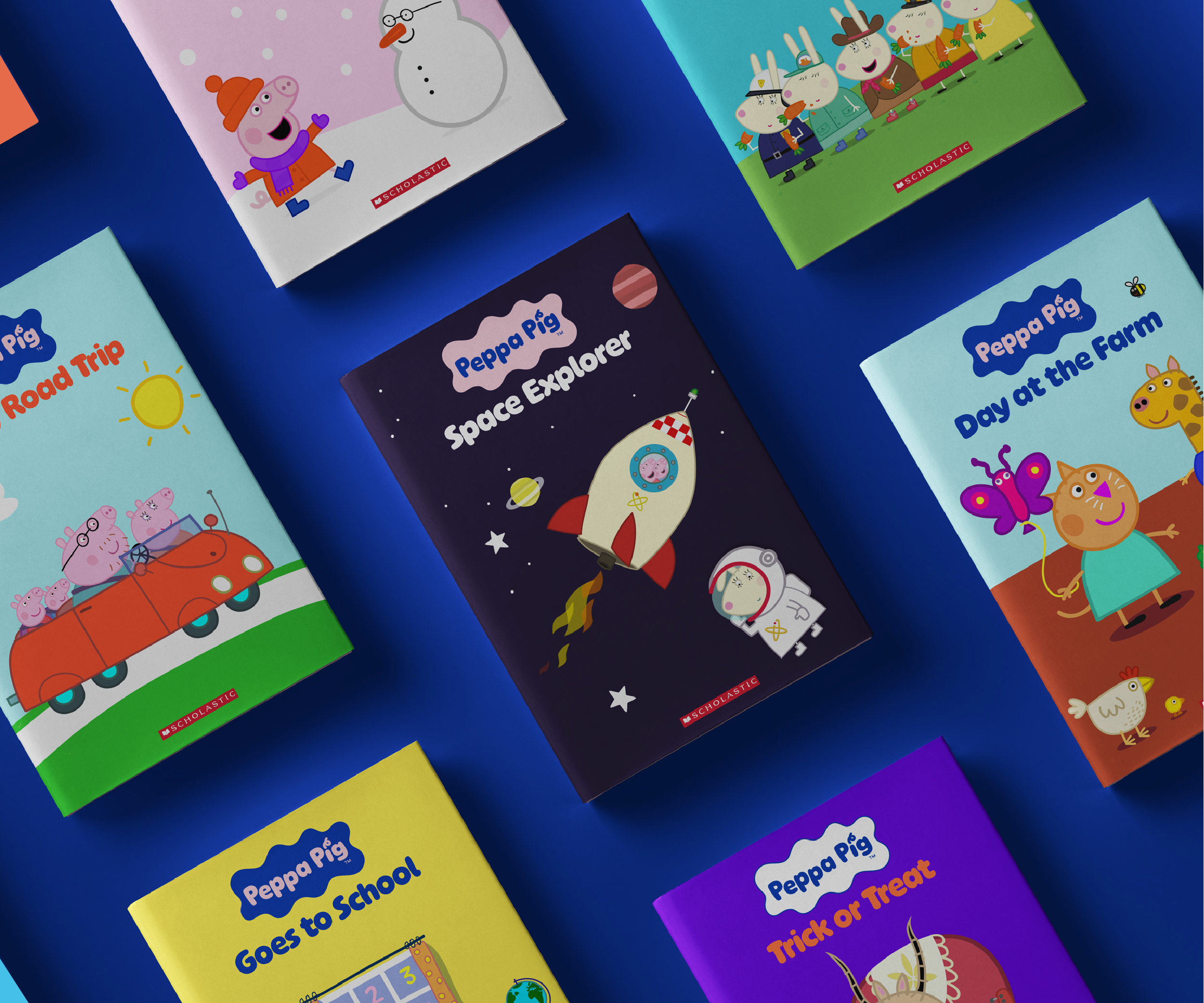
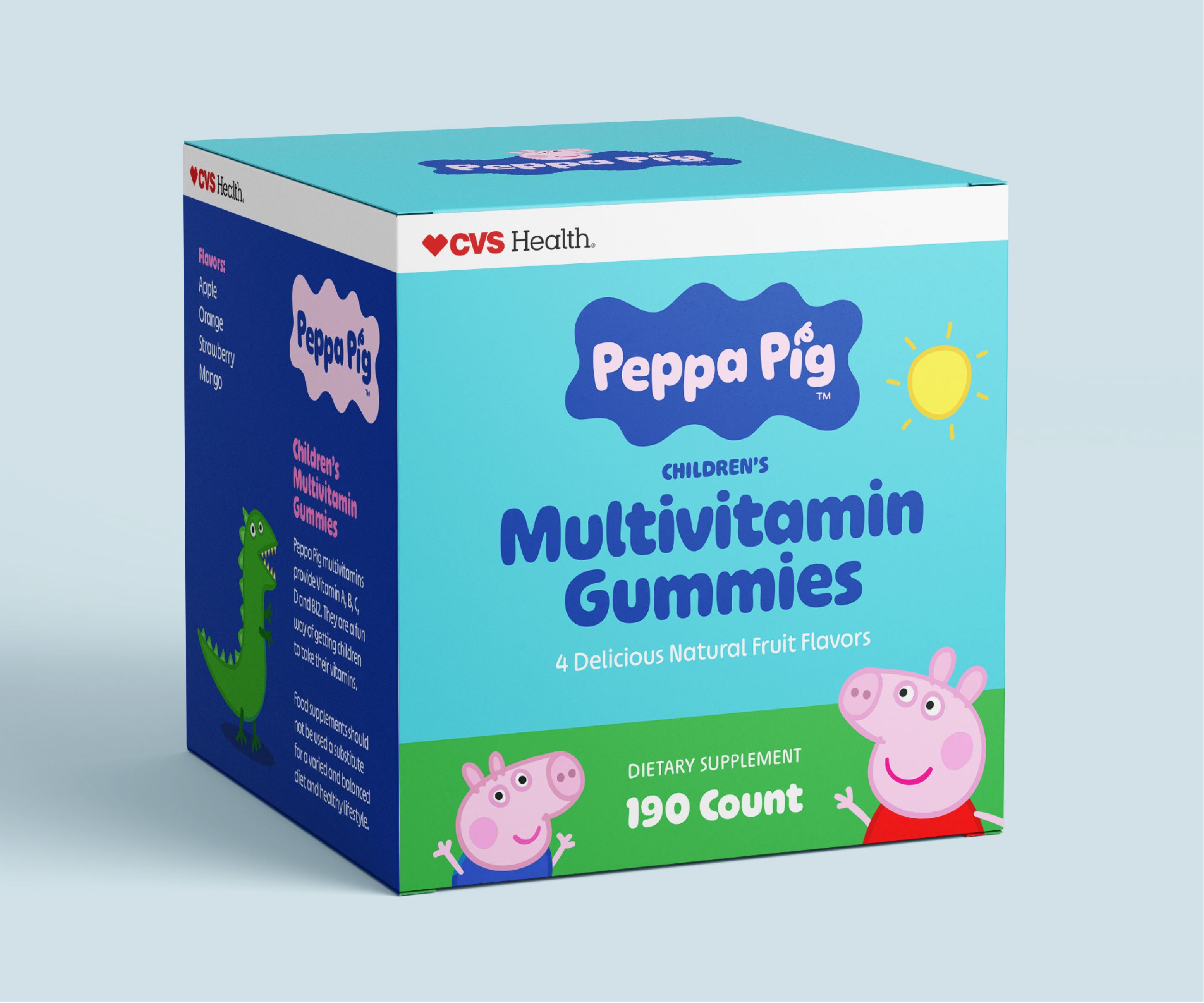
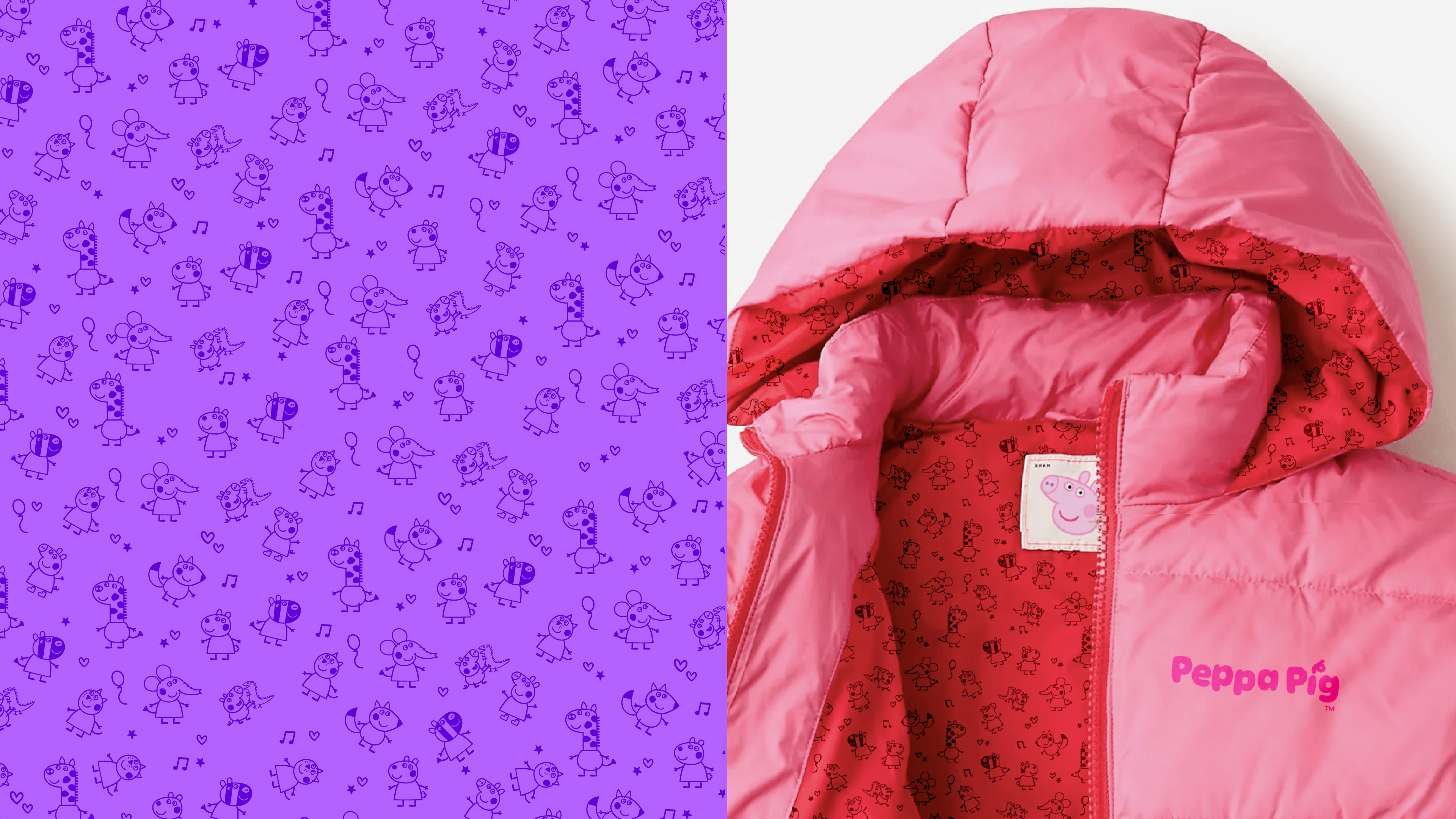
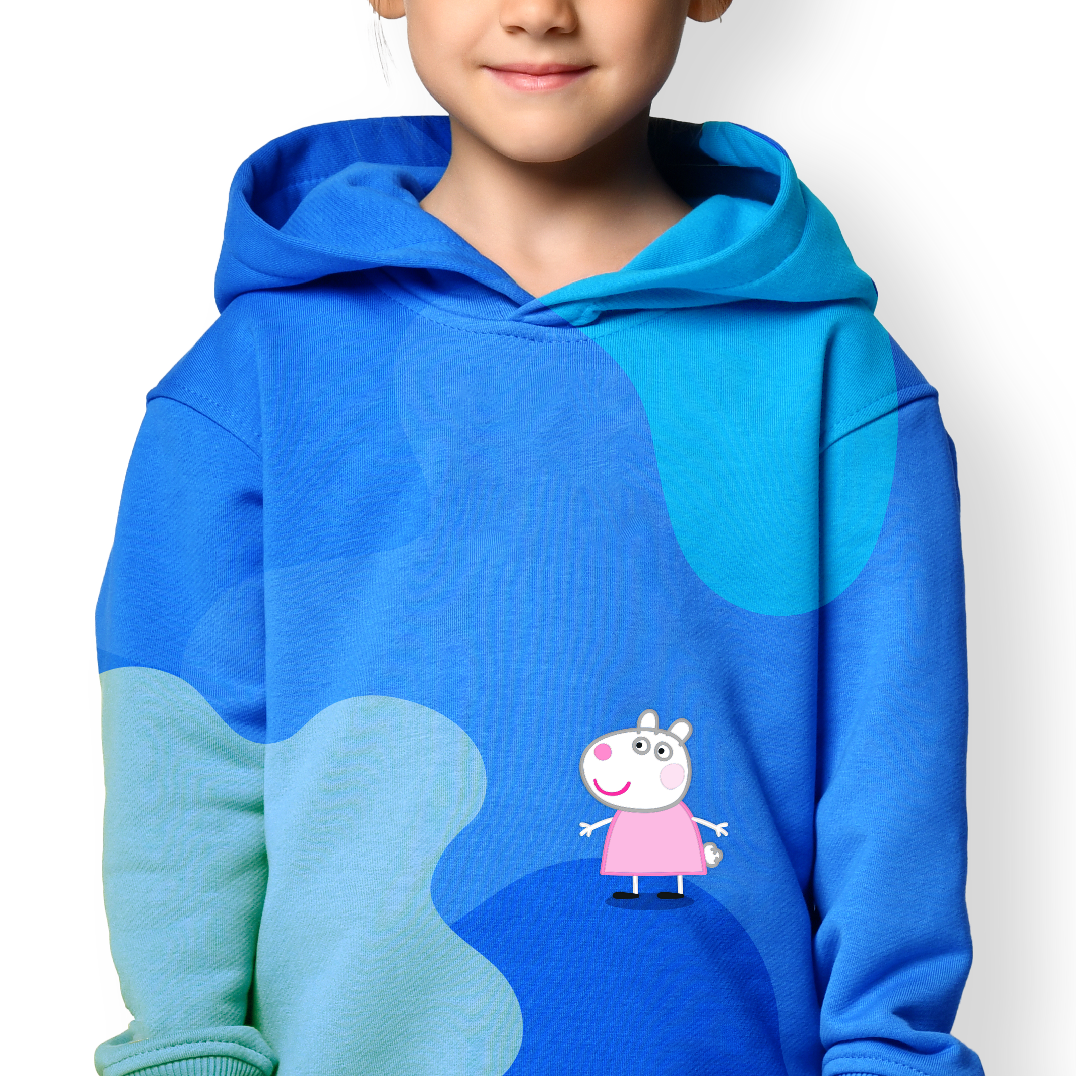
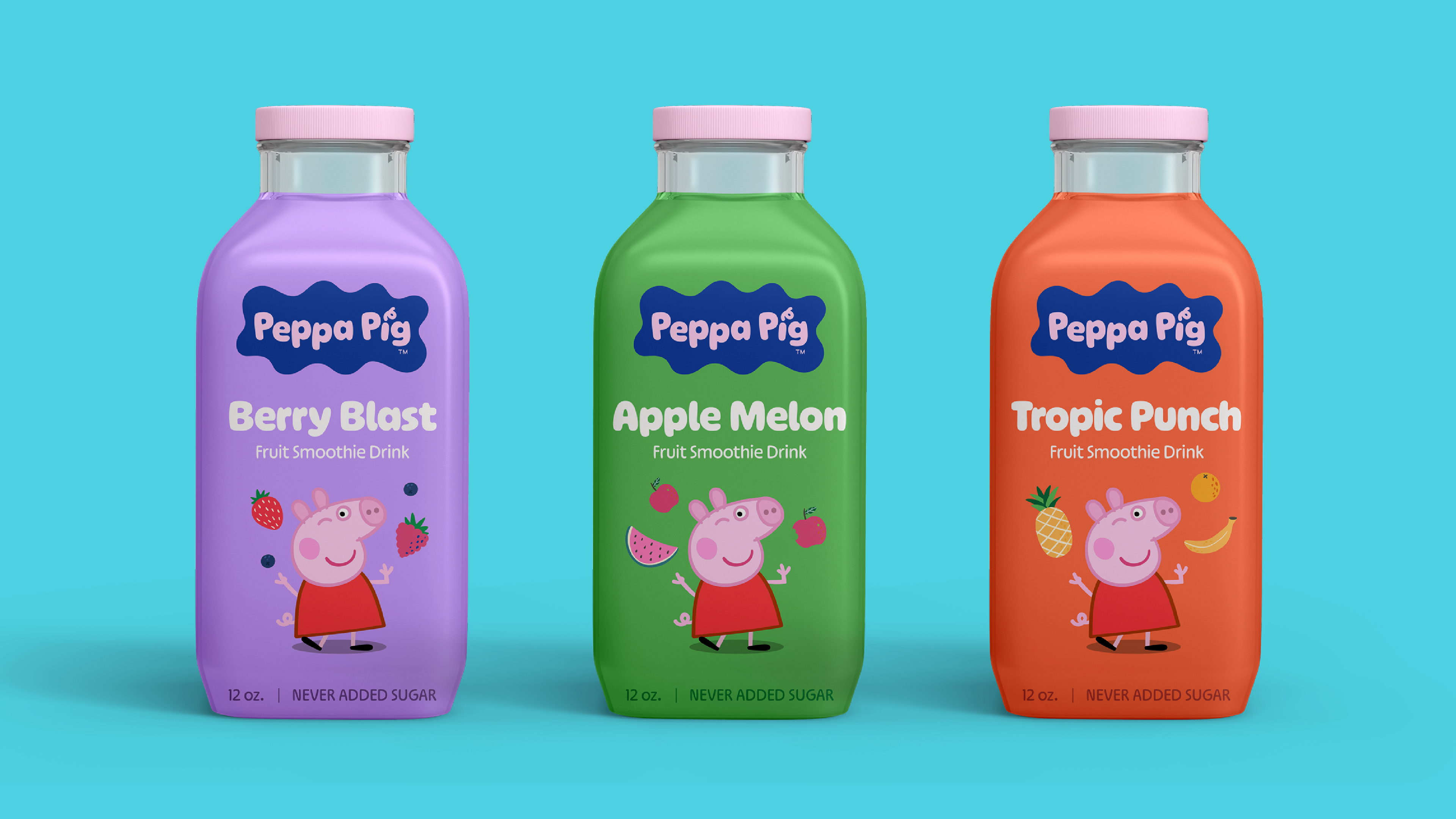
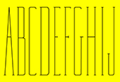
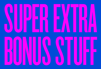
As we dug deep into the visual and verbal toolkit, and analyzed dozens of global marketing materials, it became clear that the essential brand elements needed an overhaul – from less-than-desirable color contrast, to a rainbow explosion that overstimulated the senses, to a typeface that evoked a subtle immaturity. Therefore we rebuilt the core visual assets to inject a more modern, bold and inviting personality to Peppa's world. This included a new logo suite, a custom variable font and a color system that retained its celebratory nature, but resulted in a more thoughtful and intentional brand expression.
Created by the talented team at FutureBrand.
Previous brand expression